Monday, July 31, 2006

Political Ad Reviews its own Political Ad

With Bush's Baby Brother Jeb almost done as Florida's Governor, the race is on to take his seat. Rod Smith's PR people attempt to give us two ads in one, with Rod admonishing his campaign staff to also include his folksy farm upbringing story in future ads before making them sit through another viewing of his standard issue stump speech ad.

This is weird, and I'm not sure it will work. But then again, it's Florida, where "fair elections and honest recounts" are actually campaign issues.

Bookmark and Share

Wonderful, Wonderful Smoking Pleasure

Hopefully you can appreciate the joys of smoking extolled in these old ads from back when lying in advertising wasn't regulated by the feds.

Smoking and Swinging - this couple is having the time of their lives. I can Taste the Menthol Freshness.


This one's even better. The Winchester dude is about to get some action from the damsel in distress. He looks and acts like "White Goodman" from Dodgeball, as played by Ben Stiller.

Bookmark and Share

Saturday, July 29, 2006

Branding the War

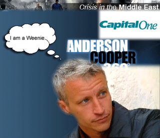
Hi, I'm Anderson Cooper, and I think I am pretty damned cool over here in the desert. I used to flinch when the artillery shells went off. Not anymore. I am battle hardened now.Fox News was calling it "Cost of Freedom," while CNN is going with the more generic "CRISIS! (drum, drum drum) In the Middle East"
They should call it "Crisis In The Middle East, starring Anderson Cooper" brought to you by Capital One. (With really cool fly-over battlefield graphics brought to you by our friends at Google Earth.)

This guy may be a good journalist and we can forgive his silver-spooned upbringing, but the war is not about you, Grandstanderson Pooper, and we don't care to hear about your "hardship" as you stay embedded with Israeli troops. Go hang out with Hezbollah for a few days and get that story, then you might earn some respect.

Bloggers of the Middle East are in a rage at what they perceive as the one-sided, truth-hiding coverage of CNN.

Bookmark and Share

Friday, July 28, 2006

Sometimes, It's Not Art

Click me and I get bigger.The eternal battle of Sales vs. Creative rages on.

A long, long time ago, artists who wanted to make a living with their art had to find patrons. The noblemen and women would commission the artists to paint the family portrait or write the play that ridiculed their rivals. A subversive symbol inserted here, a knowing line tossed in there. The artists got paid, the rich royals got what they wanted, and everyone was happy. Few were the artists or writers who found the patron willing to say, “Do whatever you want, man! Here’s some money. Go wild!”

Today, the artist’s patron is the client. We have to do what they want, insert the call to action and swallow our artistic pride. Sometimes the “sale” really is the thing, and if your art isn’t ringing the register you probably won’t have a patron for very much longer. Sure, there are some of you in the big shops who get to play with big budgets and make some fantastic works of art, but for most of us toiling in the trenches, our clients want to see ROI. (I hate that term.) We fight with the Sales Folks who want to see bigger phone numbers, bigger fonts, louder colors, crazier calls to action. And if the work fails to bring in revenue, we hear about it.

There is a balance to be struck, and a good salesperson (unless they’re from the Direct Mail School) knows that art is oftentimes what catches the eye of the potential customer. And unless the modern artist has that rare and giant client who cares only that people saw their ad and remembered it, she’s got to be willing to meet Sales halfway.

Bookmark and Share

Thursday, July 27, 2006

David Ogilvy on Search

(Editor's Note: This article written by Where's My Jetpack? originally appeared in the AdTech Daily publication at AdTech New York)

What does some old dinosaur who isn’t even with us anymore know about Search Engine Marketing? Pretty much everything.

Traditional advertising agencies have long turned up their noses to the practice of Search Engine Marketing, but perhaps they may finally be getting the message that Search actually works and it’s time to start devoting a healthy percentage of their practices to it. I’m not talking about fun FLASH banner ads and funny little sites that showcase real technical and creative talent on behalf of a client. I’m talking about the Search Engine Results Pages.

The problem for many is that Search is not glamorous; it’s just words. Most agencies will now at the least reserve a little corner of their suite where they keep “the Interactive Marketing freaks,” but the real fun is still in TV, radio and other high profile, glamour-hogging arenas. There is no punch, zip or zing in the Search campaign. There are no fancy storyboards or thought-provoking imagery.
The Man

Maybe traditional ad agencies are forgetting the words of one of the long-revered gurus of the field, David Ogilvy. Ogilvy died in 1999 and didn’t get to see the full-circle that advertising would take. Often referred to as the “Father of Advertising,” Ogilvy preferred words to images. If he were still in the game today, he would likely enjoy creating PPC ads.

The following are a few quotes of Ogilvy’s. It doesn’t take much imagination to apply them to Search.“I do not regard advertising as entertainment or an art form, but as a medium of information.”

“Advertising is a business of words, but advertising agencies are infested with men and women who cannot write. They cannot write advertisements, and they cannot write plans. They are helpless as deaf mutes on the stage of the Metropolitan Opera.”

“On the average, five times as many people read the headline as read the body copy. When you have written your headline, you have spent eighty cents out of your dollar.”

“Shakespeare wrote his sonnets within a strict discipline, fourteen lines of iambic pentameter, rhyming in three quatrains and a couplet. Were his sonnets dull? Mozart wrote his sonatas within an equally rigid discipline - exposition, development, and recapitulation. Were they dull?”

“The headline is the 'ticket on the meat.' Use it to flag down readers who are prospects for the kind of product you are advertising.”

“There is no need for advertisements to look like advertisements. If you make them look like editorial pages, you will attract about 50 per cent more readers.”

“What really decides consumers to buy or not to buy is the content of your advertising, not its form.”

It’s all come back to headlines, words and information. Try fitting a creative, attention-grabbing headline into a 25-character space. Now make your prospect click on your ad using just two lines of 35 characters each. True advertisers should love this game.

Keeping up with Search today is like trying to follow a bumblebee in flight. Darting here and there, hovering for a few moments in one spot and then zipping off in another direction, Search seems too often to be blown by the next breeze or lured by the latest sweet-smelling flower. But it’s really just words. SEO, SEM, tags, meta-tags, keywords, key phrases, xml feeds, page titles, descriptions, landing pages, information pages; they’re all just words.

Naturally, Black Hatters aren’t helping the image of the erratic flight path, only they make Search look more like a bat, hiding in caves and coming out at night, concealing their tactics and appearing only to feed on easy prey. This is nothing new. Advertising has always had a Dark Side, practitioners who rely on less than honest means to make the sale.

It’s time for the search firms and the old-school agencies to come together as equal partners. The buyers are now online as much as they are reading magazines and watching TV. And I think if David Ogilvy were still around, he’d be sitting alongside his copywriters and PPC specialists, thrilling to the creative challenge of using only words.

Bookmark and Share

Ad Freak Off My List of Cool Places

I asked Ad Freak to link to Where's My Jetpack? and they politely said, "You're nobody and we won't link to you." (That's my paraphrase, but that's the gist of it.)

So their link is now gone from my "Cool Places" list at right. I'll still check in on them to see what they're up to, but no free linkage to those who find themselves too important. Adios, Freaks. It's only advertising. You're not changing the world.

Bookmark and Share

Darrin Stephens: Ad Man Extraodinaire

I know many in the industry are too young to remember "Bewitched" the TV series, ("In Color!" Elizabeth Montgomery would cheerily announce) but Darrin Stephens was my first inspiration to go into advertising. (When the "Brady Bunch" came along, I changed my career goals to architecture, but I soon found out that there's a whole lotta math involved there.)

Darrin worked for MacMahon and Tate, which as far as we viewers knew, consisted of Darrin, his boss Larry Tate, and a receptionist. Larry and Darrin would land the accounts and then Darrin always did the creative concepting, WITHOUT any help, he insisted, from his witch wife. He was determined not to practice the Black Arts when it came to advertising. Samantha was to stay at home in the suburbs and raise their two half-magic children. She sometimes got in the way, but only to help poor Darrin, who was beset on all sides by idiots, not the least of which was Larry, who was always mixing drinks in the office before lunch.

Darrin was that rare ad guy who was wasn't fully an Account Executive and not really a Creative either. He wore a suit, went out on the sales calls, then came back to his drawing desk to storyboard his ideas. He often worked in his home office, up late at night to come up with the winning campaign for some national soup or tuna brand. He never made partner, but did all the work for Larry, even though Larry was regularly throwing him under the bus at client meetings.

For the most part, Darrin kept the witchcraft out of his work, but he was sort of clueless in that regard. Even without Sam's help, advertising in the late 60s and early 70s was already full of deviousness and trickery. It really always has been.

It would be cool if advertisers didn't prey on fear, insecurity, jealousy, lust, greed, gluttony, envy, pride and laziness - but those are the routes into the wallet, we've discovered.

Which is why I applaud the newer wave of silly advertising, like the Burger King work currently going on down in Miami. Makes you laugh, without making you feel like your life will be hollow for not buying a sausage biscuit. Or the long-running "real men of genius" radio spots for Bud Light conceived up in Chicago . Great fun, and no attempts to make me feel like a loser if I don't drink Bud Light.

But here's the deal: I will never drink Bud Light. I actually had to look up "real men of genius" on Google to find out which beer the ads were made to promote. I'm a Corona Light guy. Has DDB failed their client if I don't reach for Bud Light the next time I'm at the grocery store cooler, the "Real Men of Genius" song going through my head?

Larry Tate would say yes - and would fire Darrin in a heartbeat.

Bookmark and Share

Wednesday, July 26, 2006

So...Maybe Banner Ads DO Work

...sometimes. On another site, I was ranting about the death of the banner. I think I need to retract that post.

I was over at the Kelly Blue Book site last night, wondering if our piece of crap old Saab was worth fixing or if it might be better to just throw it away.

After a very simple narrowing down process to find the vehicle I was after, the smart folks at Kelly Blue Book served me uKellybluebookbannerp a banner that caught my eye.

Note that I was searching a 1992 4-door Saab hatchback. So Kelly grabs my info and customizes a banner, knowing that I have a crappy old Saab that isnt' worth much. Ding - I get a banner for a brand new 4-door Saab. Kind of simple, but still, very smart and the way banners should be done, provided you have the inventory that Kelly apparently does. I know Amazon and the like have been doing this sort of search-based suggestion stuff for years, but I am used to banners that flash in horrible colors and shout at me about products I neither want nor need.

Did I click on it? No. I don't have a spare $35 K to toss at a new car. But still, this is how it's done. It made me look anyway, whereas I usually don't even glance at the tops of pages.

Bookmark and Share

Not Another Advertising Blog!

Yes, another advertising blog.

Within this little space I will rant, praise and generally gripe about advertising and marketing, which, while it makes the world go 'round, could always be improved - which is why I entered the field in the first place.

Bookmark and Share

Tuesday, July 25, 2006

Archive of Old Open Mic Night Entries

My cover of "Dock of the Bay" - the timeless Otis Redding classic.


Andre Cliche (Talk to Me) A song about a guy who is way cooler than you.


Babylonian Blues. Pretty much a true story.


Time's New Romans - a song derived from landscaping.


If You Want me to Stay. Classic then. Classic now.


THIS is why Hendrix is cool to me.

Bookmark and Share